
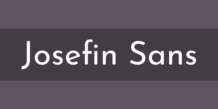
Josefin Sans Font Review:
Josefin Sans is a geometric, elegant, vintage font meant for use in larger sizes. It is inspired by some geometric styles in the 1920s, including Rudolf Koch’s Kabel (1927), Rudolf Wolf’s Memphis ( 1930), and Paul Renner’s Futura.
The low x-height makes it ideal for display and headlines. It is available in six weights plus italics.
Josefin Sans:
Josefin Sans Font is a clean, elegant sans-serif font designed by Santiago Orozco. It’s inspired by geometric typeface designs from the 1920s.
Josefin Sans comes with 10 different font weights and styles. It’s perfect for use in headlines or large text with a creative flair.
With a strong x-height, Josefin Sans pairs well with minimalist serif fonts like Minion Pro and Poppl-Laudatio. This pairing creates a friendly and modern feeling.
Another combination that works well for digital start-ups and technology companies is PT Sans and PT Sans Narrow. They both have a clean aesthetic and are ideal for digital projects that require clarity of the text.
The letters in Playfair Display have a high contrast that can be difficult to read in small sizes, so it’s best to only use it for headings. On the other hand, Fauna One is a simple and easy-to-follow sans-serif font that can be used for body copy.
Josefin Slab:
Josefin Slab is a slab serif font that was inspired by geometric sans-serif typefaces from the 1930s. It was designed by Santiago Orozco and is available in six weights with matching italics from Google Fonts.
When designing the Josefin family, Orozco set out to create something between Kabel (a typeface that resembles the structure of a circle) and Memphis (a geometric Egyptian serif that reflects the style of German geometric sans-serifs like Futura), but with modern details.
He also wanted to add character. The result is a unique typeface that feels stable and solid.
Josefin Slab is great for headlines and call-out copy, especially in its thinner weight. However, it won’t work well in long paragraphs because of the frail lines.
Josefin Italic:
Josefin Sans Italic is a typeface created by Santiago Orozco and inspired by classic geometric fonts of the 1920s. It is ideal for headlines or text that has a creative flair. It comes in ten different font weights and styles and can be used anywhere on your website.
Its creator, Santiago Orozco based Josefin Sans on the work of Rudolf Koch’s Kabel (1927) and Rudolf Wolf’s Memphis (1930) to create a vintage feel. This elegant and geometric typeface is great for large sizes and pairs well with Cardo, Abril Fatface, Yeseva One, Lato, and Playfair Display.
Josefin Sans works well with Montserrat, Roboto, and Open Sans, but you can also use it with private PT Sans for a more introverted style. The rounded, clean letters of Montserrat create an elegant appearance.
Josefin Bold:
Josefin Sans is a geometric sans serif typeface designed by Santiago Orozco with a vintage feeling, meant to be used in larger sizes. So, the font is based on Rudolf Koch’s Kabel (1927), Rudolf Wolf’s Memphis (1930), and Paul Renner’s Futura (1927).
It’s ideal for titling, as it’s a clean and modern typeface that’s also very vintage looking. So, it’s perfect for pairing with a classic serif typeface, like Helvetica Neue or Garamond, to create an old-fashioned yet timeless aesthetic.
It’s a good choice for headlines or displays text, and the narrow characters make it easy to read. So, it works well in a variety of styles, and you can find it in a range of different weights, including thin.


