Cooper Black Font:
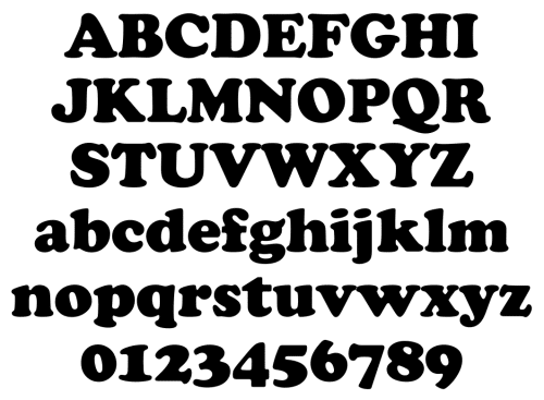
Cooper Black is a font that’s been around for a long time. It’s a typeface that can be found everywhere, and it’s become a staple for hip-hop album covers, food packaging, and advertising.
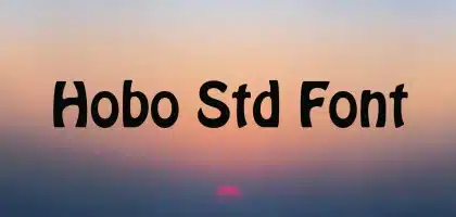
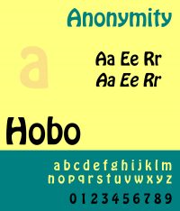
It’s also a font that’s been misunderstood by some designers. So, it’s often mistaken for Dom Casual or Hobo, but true font lovers know that Cooper is a nice face!
It’s a font you can trust:
Cooper Black Font is a typeface that has become so ubiquitous that most designers have used it at some point in their careers. Its popularity is due in large part to the fact that it was made for a specific audience and can be trusted to get the job done.
Cooper Black was designed by Oswald Bruce Cooper in 1921, and was released in 1922 through the Barnhart Brothers & Spindler-type foundry. Critics were quick to call it the “Black Menace” but Cooper Black quickly became a staple in American advertising, and was one of the most successful types of the 1920s.
Its rounded serifs and thick lettering make it an imposing presence on the page, but that’s not necessarily a bad thing. It’s often used as a stand-alone font that complements other designs when used conservatively, and it’s a great choice for logos or flyers that need to be legible at a distance.
It’s a font you can play with:
Cooper Black is a typeface that has appeared on everything from hip-hop album covers to Garfield comics, and food packaging to signage for neighborhood businesses. It’s a font that has been around for over 100 years and it remains popular today.
There’s a certain ironic counter-culture aesthetic to Cooper Black that has given it some staying power. And it’s a good idea to tap into that when you want to create something playful and edgy but not too kitschy.
For example, Alvin Diec uses the font in all caps to make it feel off-kilter. This is a really clever move that plays against the fact that this typeface has become so ubiquitous.
I’ve also seen designers who use this typeface in their designs without worrying about the cultural cache that it enjoys. Such as this spread from New York Magazine. It’s refreshing to see that a great designer can take a typeface and use it with confidence.
It’s a font you can change:
Cooper Black Font is a bold, heavy typeface that is best used for headlines and short blocks of text. It has a unique personality and can be a great way to add a retro or vintage feel to your designs.
You might have seen this oversized serif typeface on album covers, in comics, and in advertising. It’s a typeface that has a cultural cache. And it’s refreshing to see designers who don’t let the stigma associated with it dictate how they use it in their work.
This review spotlights several instances where it’s been successful. Including a Thundercats album cover that pulls the letters close together and an illustration for DeepLocal that tracks out the rounded characters to match the tone of the artwork.
Cooper Black is a font that has been around for over 100 years. But it’s still popular in modern design. It can be a challenging font to use in some situations. But it can also be a great addition to your library of typography tools.
It’s a font you can’t ignore:
Designed by Oswald Cooper in 1920. Cooper Black is one of the most popular typefaces in the world. It’s been in use for a century and can be seen everywhere. From movie and album titles to jewelry and even ramen noodles.
It’s no secret that Cooper Black has a quirky, playful appearance. But what isn’t obvious is the diversity of its uses and why it has endured for so long.
This Vox video from designers Steven Heller and Bethany Heck explores the history of Cooper Black. And why it has become such a stalwart in pop culture. It’s an interesting look at how a typeface can remain relevant through the generations. Even when its cultural cache isn’t always apparent.
The hefty, exaggerated serifs in Cooper Black make it a standout for print. But it can also play well in digital design. For example, Courier and Pica 10 Pitch, are both monospace fonts. Can be used to complement it by breaking up the mechanical nature of its rounded characters and small counters.

![Techno Font Style APK [Download] techno-font-style-apk](https://samsungfontsapk.com/wp-content/uploads/2022/03/Techno-Font-Style-APK-e1646944904517.jpeg)
