
Abril Display Font:
Abril Display font was designed to resemble heavy titling fonts of the nineteenth century. It was conceived for intensive editorial use in newspapers and pocketbooks. Its text styles are engineered with the right color, texture, and overall width for comfortable continuous reading on both printed and digital media.
Its rugged shapes stand up well to screen rendering and are complemented by a full set of OpenType features. This includes ligatures and ornaments.
Characteristics:
The Abril font is a credible contemporary interpretation of a classic news face, conceived for intensive editorial use in newspapers and digital media. Its titling styles grab attention with their curves and good color, while the text styles are engineered to achieve adequate color, texture, and overall width for comfortable continuous reading in smaller point sizes.
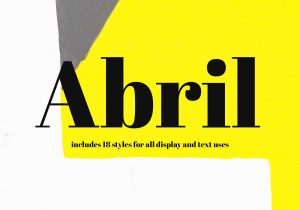
The family was designed by Veronika Burian and Jose Scaglione at TypeTogether. It includes 18 styles for display and text, typographic extensions like motifs, borders special dingbats, alternates, and numbers.
Usable Didone web fonts are hard to come by; however, Abril’s rugged shapes stand up well to the screen and render smoothly with manual TrueType hinting and PostScript-based outlines. It pairs beautifully with Franklin Gothic URW, Anonymous, Aktiv Grotesk, Brandon Grotesque, and FF Spinoza for an elegant look that is suitable for headlines and large formats. It also pairs well with Inter and Raleway for a more modern and minimalistic approach to design.
Weights:
Designed by Veronika Burian and Jose Scaglione, the Abril Display font family was conceived specifically for intensive editorial use whether it’s in newspapers, pocketbooks, or digital media. Its titling weights, based on a contemporary revamp of classic Didone styles, exhibit both neutrality and a strong presence on the page by grabbing the reader’s attention with measured tension in its curves, good color, and high contrast. The font also features typographic niceties. Like ornaments, borders, special dingbats, and alternate letters and numbers that propose a broad palette of tools to the designer.
The family’s “Text” styles, on the other hand, are more closely inspired by both 19th-century slab serifs and Scotch Roman types and exhibit more of a newsy feel. Although they share the same chiseled ball terminals and flexed stroke endings as the titling weights, their higher contrast toned down their formality to be more useful for continuous reading in print and web environments. Moreover, their letter forms were engineered to achieve the right color, texture, and overall width for comfortable reading.
Italics:
In an era when desktop publishing has given us the impression that one font can do it all. TypeTogether has done a fine job of designing two complementary fonts for text and display uses. The rugged shapes of Abril Fatface. Its Display counterpart stands up to the rigors of editorial printing, while Abril Text has been engineered. From scratch to achieve the right color, texture, and width for reading.
Both variants are complemented with genuine italics that enhance their neutrality and strong presence on the page. Attracting the reader’s attention through measured tension in curves, good color, and high contrast. Typographic niceties such as ornaments, borders, and special dingbats are offered to further expand the palette of tools available to the designer.
Abril is a lean Didone Roman that brings Didone romanticism to a sea of screen-safe sans serifs and provides a useful alternative to the preeminent screen Scotch Roman, Georgia. It’s also a great choice for editorial use and pairs well with other modern serifs. Such as Franklin Gothic URW, Anonymous, Aktiv Grotesk, Brandon Grotesque, and FF Spinoza.
OpenType features
The Abril family was conceived for extensive editorial use in newspapers, pocketbooks, and annual reports. Its Display styles have a strong presence and newsy feel on the page. Text styles were engineered from scratch to achieve the right color, texture, and overall width for comfort. Extended reading in both print and digital environments.
The weighty titling styles, inspired by a contemporary revamp of classic Didone styles, display. Both neutrality and a strong presence on the page capture the reader’s attention with measured tension. Through its curves, good color, and high contrast. The family also includes some typographic niceties, including ornaments, borders, and special dingbats. That proposes a broad palette of tools to the designer.
The Abril family comes with a full set of OpenType features, such as ligatures and small caps. It is compatible with all major browsers and can be used on desktop computers, tablets, and mobile devices. It also supports more than 50 languages, including Central and Northern European languages.


